Contact Page Design Best Practices for Small Businesses
Your contact us page can make or break a lead. Poor design creates hesitation, while clear structure encourages action. Below are contact page design best practices that help small businesses generate more inquiries.
-
Chris Granat
- Updated:
Key Takeaways for High-Converting Contact Pages
A high-converting contact page removes friction, builds trust, and makes it easy for visitors to take the next step.
-
Contact pages should prioritize clarity and ease of use over visual complexity or extra content.
-
Fewer form fields and clear calls to action typically lead to higher submission rates.
-
Mobile-friendly layouts are essential, as many contact requests happen on phones.
-
Trust signals and clear expectations reduce hesitation and improve lead quality.
Why Contact Page Design Directly Impacts Lead Generation
Many small businesses assume that once a visitor reaches the contact us page, a form submission is almost guaranteed. In reality, this is often the moment when hesitation is highest. Visitors pause to assess whether the business feels legitimate, responsive, and worth their time.
Contact page design directly influences that decision. Clear layouts, predictable structure, and reassuring cues help visitors move forward with confidence. When a contact page feels cluttered, confusing, or incomplete, even highly interested users may abandon it without taking action.
Keep the Primary Goal Simple and Obvious
A contact page should focus on one clear outcome: helping visitors get in touch without friction. When pages try to do too much, they create unnecessary cognitive load. Extra messaging, promotions, or navigation options can distract visitors from the action you want them to take.
Strong contact pages guide attention intentionally. Visual hierarchy, spacing, and clear calls to action make it obvious what to do next. Simplicity does not mean lack of professionalism—it means removing anything that interferes with conversion.
Best practices include:
-
One primary call to action
-
Minimal distractions or competing links
-
Clear visual focus on the contact form or main contact method
Use a Short, Focused Contact Form
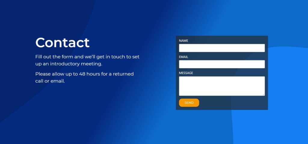
Contact forms are often the biggest barrier between interest and action. The more information you ask for upfront, the more effort you require from the visitor. Many users will abandon a form if it feels time-consuming or invasive.
High-converting contact pages ask only for information that is truly necessary at the first stage. Additional details can always be collected later through follow-up conversations. A short, well-designed form signals respect for the visitor’s time.
Usability research consistently shows that shorter, simpler forms lead to higher completion rates, especially on mobile devices, where friction is amplified.
Effective contact forms typically:
-
Limit the number of required fields
-
Use clear, descriptive labels
-
Avoid unnecessary dropdowns or multi-step flows
Design the Contact Page for Mobile Users First
Mobile users make up a large portion of contact us page traffic for many small businesses. If your contact page is difficult to use on a phone, you are losing leads without realizing it. Mobile usability issues often go unnoticed during desktop-focused design reviews.
A mobile-first contact page prioritizes ease of interaction. Form fields should be easy to tap, text should be readable without zooming, and important contact details should be immediately accessible. Performance also matters, as slow-loading pages increase abandonment rates.
Mobile-friendly contact page design includes:
-
Large, tappable input fields
-
Proper spacing between elements
-
Clickable phone numbers and email links
-
Fast page load times
Reduce Anxiety With Clear Trust Signals
Visitors are often cautious about sharing their contact information. They may wonder how their data will be used or whether anyone will respond. A contact page should actively reduce these concerns rather than ignore them.
Trust signals reassure visitors that your business is legitimate and responsive. Displaying a physical address, clearly listed business hours, and service area information helps reduce uncertainty—especially for local or service-based businesses. These details signal that there is a real operation behind the website, not just a form.
Helpful trust elements include:
-
A short message explaining what happens after submission
-
Expected response time
-
Visible business information or service area
Make Contact Options Easy to Find
Not every visitor prefers the same method of contact. Some are comfortable filling out a form, while others want to call or reach out directly. A strong contact page makes essential contact info easy to find without overwhelming the layout.
Clear contact numbers, a visible email address, and a primary contact form give visitors flexibility while still guiding them toward the preferred action. When contact details are buried or inconsistent, users may leave rather than search for answers.
Trust signals reassure visitors that your business is legitimate and responsive. Displaying a physical address, clearly listed business hours, and service area information helps reduce uncertainty—especially for local or service-based businesses. These details signal that there is a real operation behind the website, not just a form.
In some cases, including social media links can be helpful, particularly for businesses that actively respond to messages on those platforms. These links should support—not distract from—the main contact method. When used thoughtfully, they give visitors an additional way to verify credibility or reach out.
Write Clear, Action-Oriented Button Copy
Button text plays a larger role in conversions than many businesses realize. Generic labels like “Submit” provide no reassurance and create uncertainty about what will happen next. Clear, action-oriented copy sets expectations and reinforces intent.
Button language should reflect the outcome the visitor wants. When users understand the action they are taking, they are more likely to complete it. Small wording changes can produce noticeable improvements in form submissions.
Examples of effective button copy include:
-
Request a Quote
-
Get in Touch
-
Send a Message
Explain What Happens After Submission
Visitors are more likely to reach out when they understand what happens after they submit a form. Letting users know that their message goes directly to a customer service team—or a specific point of contact—adds reassurance and sets expectations. This clarity makes the interaction feel personal rather than automated.
Let visitors know what to expect. Clarify when they will hear back, who will respond, and what typically happens next. This transparency builds confidence and makes the interaction feel more human.
Avoid Common Contact Page Design Mistakes
Many contact pages underperform not because of traffic issues, but because of small, avoidable mistakes. These problems often persist unnoticed for years. Regularly reviewing contact pages from a conversion perspective helps identify friction points.
Reviewing real contact us page examples can help businesses spot usability issues and design mistakes that are easy to overlook when reviewing their own website.
Common contact us page design mistakes include:
-
Requiring too many mandatory form fields
-
Failing to show a confirmation message after submission
-
Allowing slow or broken forms to go unchecked
-
Using outdated layouts that reduce trust
Contact Page Design for Service-Based Businesses
For service businesses, the contact us page is often the beginning of a working relationship. The page should reflect the professionalism and reliability clients expect. Inconsistent tone, design, or messaging can create doubt at a critical moment.
A well-designed contact page feels aligned with the rest of the website. It reinforces credibility and sets expectations before the first conversation even happens. This consistency plays a key role in lead quality, not just lead quantity.
When Professional Website Design Makes the Difference
If a contact page is not generating inquiries, traffic is rarely the main issue. More often, the problem lies in layout, messaging, or usability. Small improvements in these areas can lead to meaningful gains without increasing traffic or advertising spend.
A professional web design agency understands how UX, copy, and structure work together to reduce friction and encourage action. Contact pages are not decorative elements—they are conversion tools that deserve deliberate design.
Final Thoughts
High-converting contact pages focus on clarity, trust, and ease of use. When visitors feel confident and supported, they are far more likely to reach out. Designing a contact page is not about adding more elements—it is about removing obstacles and guiding action.
For small businesses, improving a contact page is often one of the simplest ways to increase leads without changing traffic levels.
Chris Granat
Chris is the founder and lead web designer at Flamingo Agency, a Chicago web design agency.