Website Header Design: Definition, Purpose and Best Practices
Find out what is a header and learn best practices for designing one for a small business website.
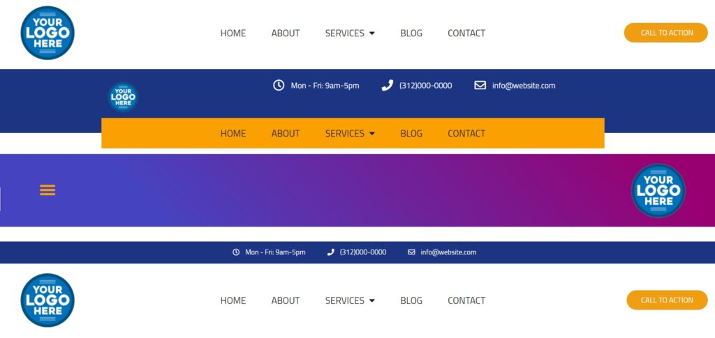
What is a website header?
The header is the very top horizontal section of every website, it appears above the fold. It’s the first thing website visitors see when they access your website and it serves a very clear function — it provides users with basic and quick information about the business and its pages.
Why is header important?
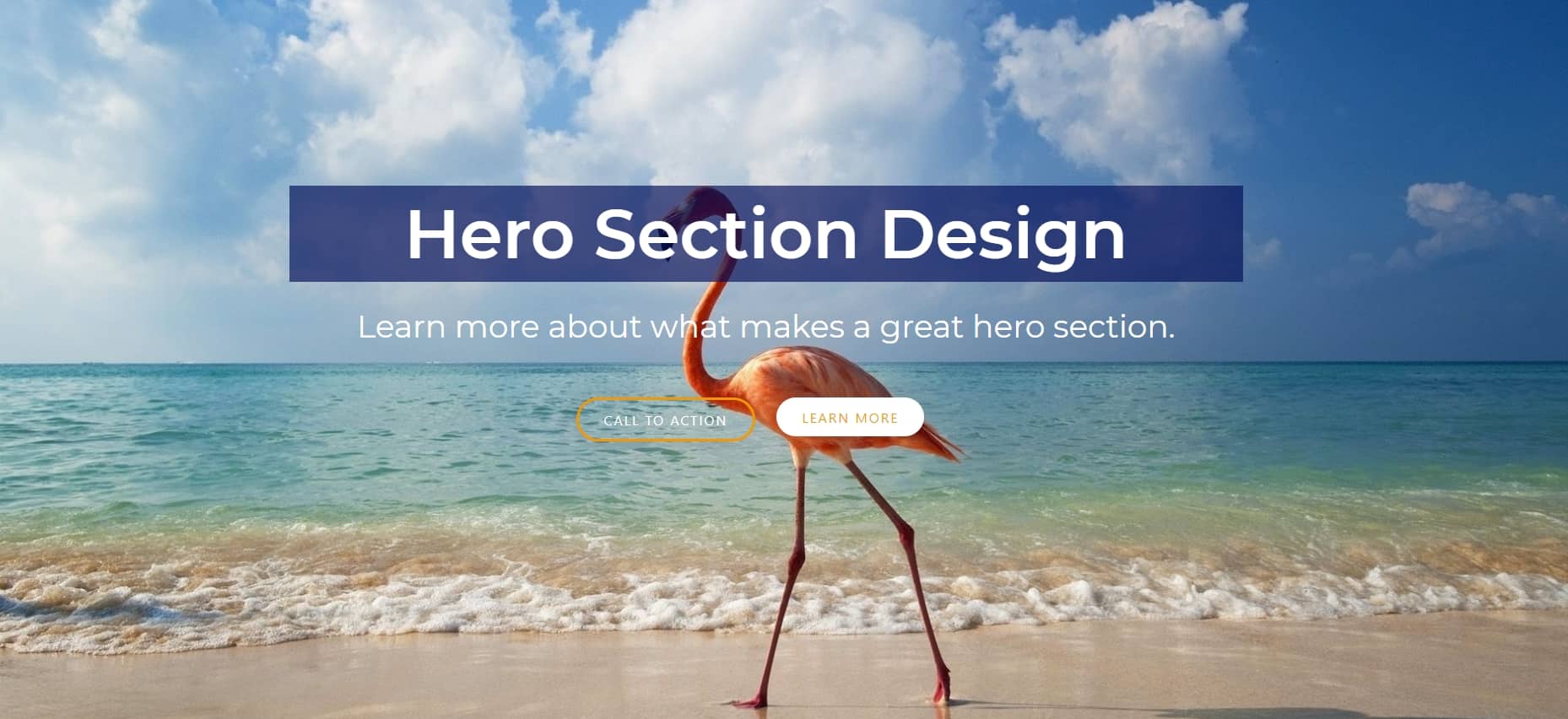
Since the header is often the first part of the website that visitors look at, it’s crucial to design and develop a powerful first impression of the site. An effective header design will not only look unique and provide information but should also guide a visitor what to do next.
What does a website header include?
There are certain elements that can be included in the header.
1. Logo
Branding and company logo is always featured in the header, typically in the upper-left corner or centered.
2. Website navigation
The navigation includes the top pages of a website. Most businesses should have the homepage, contact page, about page and a main service page at minimum.
3. Call to action
Examples include: contact us, get a quote, book a table.
4. Business information
Some businesses like to showcase their contact information in the header, such as address, phone number or email.
Best practices and tips for an effective header design
To ensure your header is effective, follow header design best practices.
1. Keep it simple
If there’s one part of a website that should keep it simple and focus on the fundamentals, it will be the header. An effective header design displays a clear message and avoids too many elements.
2. Establish a hierarchy of pages
Make sure all your top pages are easily accessible in the navigaton bar.
3. Make it interactive
There are many simple yet creative hover animations that make a simple header look a bit more interesting and modern. Try them out.
Conclusion
The header is the first thing website visitors see on your website. It’s an opportunity to convince them that they’re in the right place and should stay there! With a little advice, you can set up an attractive site with just enough information to entice people into exploring more of what you have to offer. If you need help with your website header, contact us. We can design a custom header that will make the most of your marketing opportunities. Our team is always available to answer any questions or provide feedback.
